We are pleased to announce that we have moved the play bar above the image (it used to be over the bottom of the image).
There are two reasons for moving it:
- it brings it right next to the text which is being said, which is hopefully more convenient
- it often covered up important parts of the image, so now the image will be completely visible
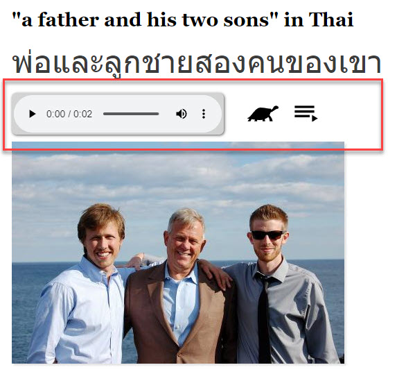
So, below is an example from https://lingopolo.org/thai/word/a-father-and-his-two-sons of the new look, with the play bar highlighted in red:

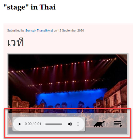
Below is an example of how it used to look, so that you can compare the two. Notice in the example below, the most important part of this image - the stage - is almost completely obscured by the play bar.

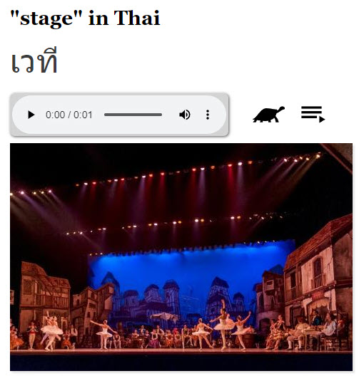
Below we show the same page https://lingopolo.org/thai/word/stage today, showing how much clearer it is with the image fully visible:

We hope the change is helpful.
And as one final note, this is one of the first changes made by our new software developer Ajay due to the war in Ukraine pausing Lingopolo development. Nice work Ajay!
