We have made a slight change to the design of the home page, replacing the previous image (of fingers on a keyboard) with the flag of the language. We thought that the flag represents more closely the site language-learning goal.
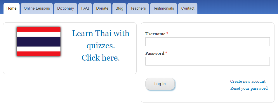
Here is the new design for the Thai login page:
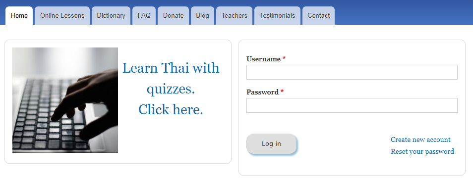
The old design, for contrast, is shown below:
When you are logged in, it will look as follows. Compared to the old design, it not only is more appropriate for the language, but it also uses less vertical space, so that your statistics are a little more visible:
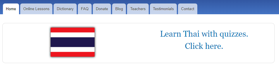
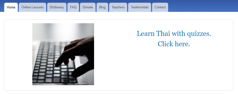
The old logged-in page looked like this:
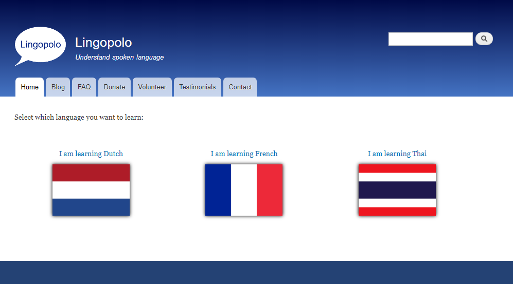
In addition, we have made a subtle change to the language selection page, making the flags slightly bigger.
Here is the new page:
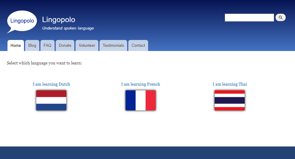
Again, so that you can compare, here is the old design:
We hope you like the new designs!