I am delighted to be able to present to you a beautiful new course page design.
Here are all the things to look out for:
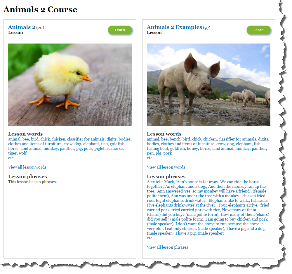
- The left and the right panel are now identical in structure. Previously the left-panel showed just the "Lesson words" and the right panel showed just the "Lesson phrases". Now both left and right panels each show the "Lesson words" and "Lesson phrases".
- It is now clearly marked "Course", and the left and right panel below are marked clearly as "Lesson". Previously, it would have just had the name of each, and so it wasn't so clear that what you were looking at was course (where a course is two lessons: one of words, and one of examples), and that the items beneath it were lessons.
- The number of words in each lesson has moved next to the title of the lesson, here the "Animals 2" lesson has 20 words, and the "Animals 2 Examples" lesson has 97 words and phrases.
- Both lessons have a nice big fat juicy "Learn" button, which you can click directly on to get immediately started on one of the lessons. Previously there was not a "Learn" button at all, so you had to click on the lesson heading to go inside the lesson to find the "Learn" button.
- The left and right panel are now shown in boxes of equal height and with a slightly more subtle grey line; just some small visual niceties, but it's always nicer to work with a quality product!
Check out the courses at the online lessons page.
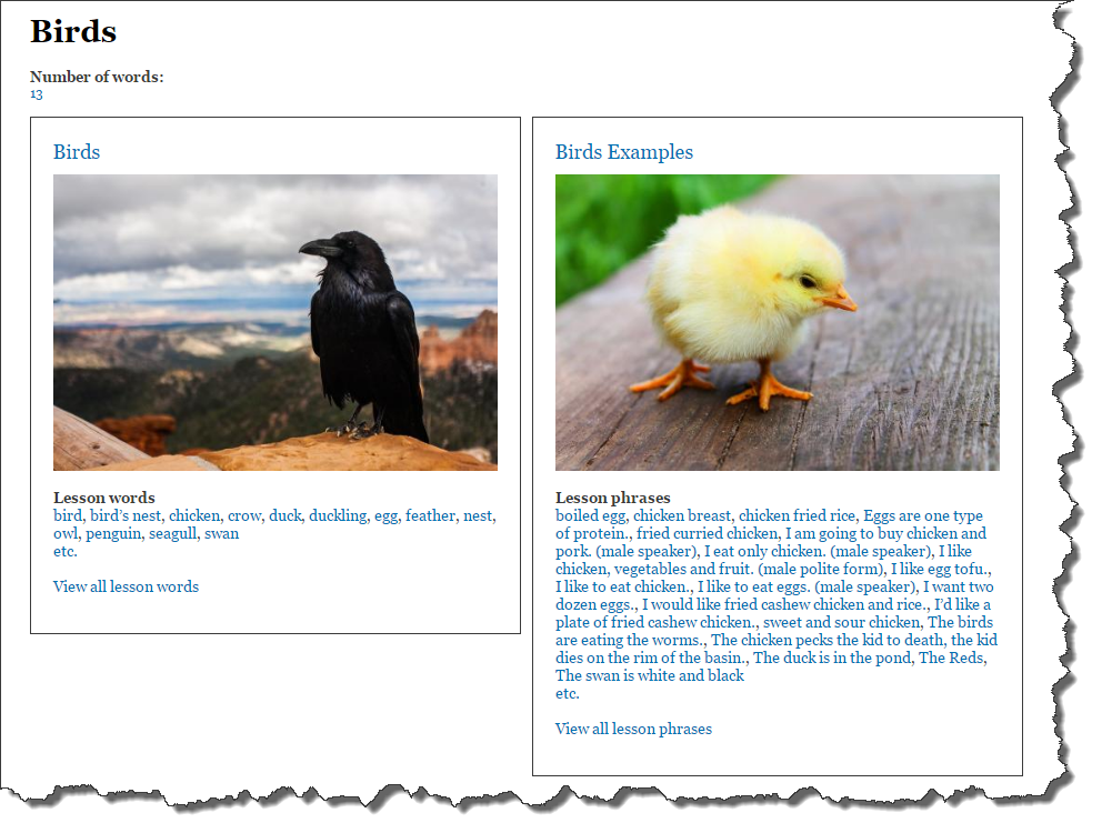
To compare, below is a screen shot of the old design: